The Challenge
As their services evolved, so too did the need for a refreshed visual identity— one that embraced a broader color palette to reflect the diversity of their clients and the multifaceted nature of their healing work.
The Approach
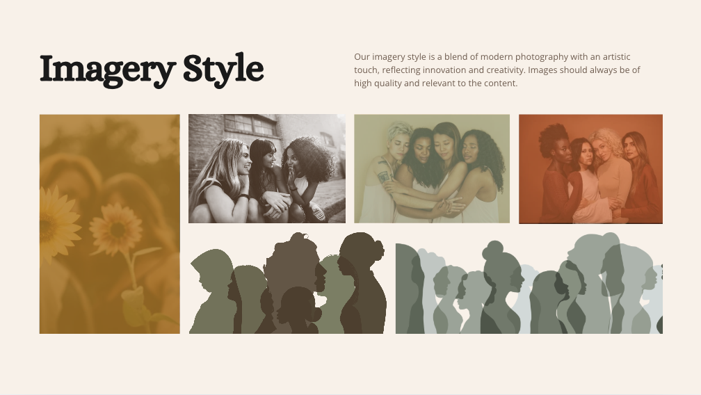
Building on their original brand, we elevated the crescent moon symbol as a core visual anchor—introducing a new set of colors, modernized typography, and expressive imagery that better resonates with both those they serve and the community that supports their mission.
The Solution
The designs created were able to help MoonLife Women’s Shelter elevate their brand by staying true and authentic to their roots and new beginnings. Bilingual elements were also delivered to further connect with their audience and to expand their reach to Spanish speaking communities.